

At 6:40 a.m., a founder sits in a leather chair with an espresso going cold, staring at a dashboard packed with revenue charts, gauges, and variance bars. It looks expensive. It looks advanced. It still doesn't answer the question that matters today: can the business make payroll and cover the materials draw on Friday?
That scene is common in founder-led companies. The reporting exists, but the decision support doesn't. A dashboard assembled from software defaults can show dozens of figures while hiding the few operating levers that control cash, margin, and capacity. The practical question isn't whether your business has a dashboard. It's whether the leadership team trusts it enough to act.
Table of Contents
- The Dashboard Problem Most Founders Don't Realize They Have
- Choosing the Five KPIs That Actually Run Your Business
- Profitability, Liquidity, and Efficiency Metrics Worth Tracking
- Dashboard Templates Built for Construction, Distribution, and Professional Services
- Wiring Up Your Data Sources Without Breaking Trust
- Governance Habits That Keep Your Dashboard Honest
- Your 30-Day Rollout Plan and Next Step
The Dashboard Problem Most Founders Don't Realize They Have
Most dashboards grow by accumulation. Someone adds revenue because it already exists in the accounting system. A manager requests a sales chart. The operations lead wants another filter. Finance adds variance bars, balance-sheet figures, and a collection of ratios. Eventually, the screen becomes a museum of available data rather than a control panel for the business.
That creates two problems. First, the founder has to interpret too much information before making a decision. Second, a few questionable figures can damage trust in every number on the page. If job costs don't reconcile, receivables are stale, or cash includes funds that are already committed to payroll and taxes, the dashboard becomes decoration.
The adoption gap makes this more serious. IBM summarized a Gartner-based finding in 2024 that only about 29% of employees actively use analytics and business intelligence tools on average, although 87% of surveyed organizations reported increased analytics adoption. IBM also noted minimal growth in active use over roughly seven years, which points to a persistent gap between buying reporting infrastructure and embedding it into daily decisions. IBM's summary of business intelligence adoption makes the distinction clear: adoption isn't the same as value realization.
The useful dashboard is not the one with the most information. It's the one that makes the next decision obvious.
A founder-led construction company might need to decide whether to slow hiring, challenge a subcontractor change order, or draw on a line of credit. A distributor may need to release a purchase order, accelerate collections, or stop buying a slow-moving product. A professional services firm may need to reprice an engagement or shift staff to protect utilization. Those decisions require a small number of trusted signals, not a wall of visuals.
That distinction is central to what financial reporting means. Reporting records and explains performance. A decision dashboard connects performance to ownership, timing, and action. The broader shift toward digital transformation in finance matters only when it improves how people allocate cash, protect margin, and respond to risk.
The fix starts with discipline. Choose the decisions first, then select the metrics, then design the page around how a founder works.
Choosing the Five KPIs That Actually Run Your Business
A primary dashboard should contain three to five decision-driving KPIs. Financial-data visualization guidance recommends a tightly focused main view, typically around five to nine KPIs or four to five key metrics, with every metric paired with a comparison such as a prior period, budget, target, or year-over-year result. This financial data visualization guidance supports a simple operating rule: if the founder can't understand the page quickly, the page is too crowded.
Start with the recurring decisions you own. Then test every candidate metric against three filters:
- Relevance: Does this number affect a decision that someone must make regularly?
- Timeliness: Will the number arrive soon enough to influence that decision?
- Comparability: Can you judge it against a prior period, budget, target, or operating standard?
A metric that fails one filter belongs in a secondary report, not the executive view. That doesn't make it useless. It means it shouldn't compete with cash, margin, collections, or the operational driver currently demanding attention.
Build the metric dictionary first
Don't design charts until every KPI has a written definition. Use this copy-ready template.
| Field | What to Write |
|---|---|
| KPI name | The plain-English name leaders will use |
| Definition | What the metric measures and what it excludes |
| Formula | The exact calculation, including accounting treatment |
| Owner | The person accountable for accuracy and interpretation |
| Source system | General ledger, payroll, CRM, project platform, bank, or another source |
| Refresh cadence | Daily, weekly, monthly, or quarterly |
| Decision served | The decision this KPI is meant to support |
| Target or threshold | The point that requires review or action |
| Validation period | The period used to confirm the calculation before launch |
| Drill-down | The detail needed to explain a variance |
This dictionary prevents a common argument between sales and finance: both teams use the same label while calculating different numbers. If you need help choosing a reporting layer, guidance on Power BI for finance professionals can help you evaluate how a familiar spreadsheet workflow might connect with structured reporting.
Reduce the list by expected behavior change
Suppose a founder starts with fifteen candidates: revenue, bookings, gross margin, EBITDA, cash balance, operating cash flow, free cash flow, DSO, current ratio, headcount, revenue per employee, sales pipeline, backlog, inventory, and accounts payable. The founder shouldn't ask which numbers are interesting. The better question is, what would I do differently if this number moved?
That test may leave five primary KPIs: operating cash flow, gross margin by job or service line, DSO, budget variance, and backlog or capacity. Revenue, bookings, and headcount can remain in supporting views if they don't trigger a weekly action. A tidy dashboard doesn't need to display every important metric. It needs to put the most actionable metrics where leadership will see them.
For a broader working list, use this guide to the financial metrics every business owner should track, then demote anything that doesn't have a clear owner and response.
Profitability, Liquidity, and Efficiency Metrics Worth Tracking
A founder needs more than a profit and loss statement. The dashboard should connect profitability, liquidity, efficiency, and operational control. Each family answers a different question.
Profitability asks whether the company earns enough from its work. Track gross margin by job, client, product, or service line, contribution margin after variable costs, and EBITDA margin. Gross margin tells you whether the underlying offering works. Contribution margin shows what remains after costs that rise with each sale. EBITDA margin provides a broader view of operating performance before interest, taxes, depreciation, and amortization.
Liquidity asks whether the company can meet obligations as they arrive. Use operating cash flow, free cash flow, days sales outstanding, days payable outstanding, and the components of the cash conversion cycle. A bank balance alone is incomplete because it doesn't show upcoming payroll, taxes, debt service, card settlements, or expected receipts. This small-business financial dashboard guidance emphasizes the need to connect cash visibility with trends, targets, threshold bands, and historical context.
Efficiency shows whether the business converts people and spending into output. Revenue per full-time employee, operating expense ratio, and software-to-revenue ratio can reveal whether overhead is scaling faster than revenue. These measures need context. A rising software ratio may reflect necessary infrastructure, while a falling revenue-per-employee figure may reflect deliberate investment in a new team.
Give every KPI a response range
Use target, warning, and action bands rather than displaying a number without interpretation. The following examples provide starting points, not universal standards.
| Metric Family | Example KPIs | Healthy Band | Refresh Cadence |
|---|---|---|---|
| Profitability | Gross margin, contribution margin, EBITDA margin | Gross margin within about 2 percentage points of benchmark | Weekly for jobs or services, monthly for consolidated margin |
| Liquidity | Current ratio, quick ratio, operating cash flow, free cash flow | Current ratio 1.5–3.0, quick ratio 1.0+, free cash flow positive across multiple quarters | Daily or weekly for cash signals, monthly for ratios |
| Collections | DSO, aging, cash conversion cycle | DSO within the company's target range, with aging exceptions assigned to owners | Weekly |
| Leverage | Debt-to-EBITDA, interest coverage | Debt-to-EBITDA under 3.0x, interest coverage above 3.0x | Monthly or quarterly |
| Efficiency | Revenue per employee, operating expense ratio, software-to-revenue | Stable or improving against budget and prior period | Monthly |
| Operational control | Job cost variance, inventory turns, utilization | Within approved operating thresholds | Weekly or monthly, depending on the driver |
These bands come from a practical SMB dashboard framework, not a promise that every company should use identical targets. The financial reporting dashboard guide also recommends reviewing revenue within +/- 5% of budget, gross margin within about 2 percentage points of benchmark, and free cash flow remaining positive across multiple quarters as examples of action-oriented thresholds.
For a deeper focus on cash timing and working capital, use the liquidity management guide. The point is simple: every metric needs a cadence and a consequence.
Dashboard Templates Built for Construction, Distribution, and Professional Services
Industry context changes the dashboard. A construction owner doesn't manage cash the same way as a distributor, and a professional services founder can't use inventory measures to understand capacity. The page should place leading operational drivers left of center, lagging financial outcomes right of center, and urgent exceptions at the top.
Construction
The primary view should lead with job-cost margin percentage, cost-to-complete variance, overbilling or underbilling exposure, and retention receivable aging. Put the weekly cash projection beside those metrics because pay applications and collection timing often determine whether accounting profit becomes usable cash.
The primary operator is the owner, project executive, and controller. Refresh job costs and commitments weekly, with cash projections updated more often when major draws or payroll obligations are approaching. Escalate when a job-cost variance threatens the approved margin or when retention aging creates a cash gap.
Construction owners can use this construction KPI guide to expand the operating view without turning the executive page into a project-management report.
Distribution
A distribution dashboard should center on inventory turn days, gross margin return on inventory, DSO, purchase-order timing, and free cash conversion. The key relationship is between what the business buys, how long inventory sits, when customers pay, and how much cash remains after operations.
The primary operator is the owner, purchasing lead, and finance manager. Refresh inventory, sales, and receivables signals daily or weekly, depending on system reliability. Escalate when inventory accumulation consumes cash without supporting margin, or when DSO and purchase-order commitments create a working-capital squeeze.
Professional services
Professional services firms need utilization rate, realization rate, revenue per full-time employee, backlog burn rate, and engagement-level margin. Utilization shows whether available capacity is being used. Realization shows whether billed work turns into collected revenue at the expected rate. Backlog burn rate connects future work to staffing decisions.
The primary operator is the managing partner or delivery leader, supported by finance. Refresh utilization and backlog weekly, while engagement margin may require a monthly close. Escalate when utilization falls below the staffing plan or when realization weakness erodes engagement margin.
| Industry | Top KPIs | Primary Operator | Refresh Cadence | Escalation Trigger |
|---|---|---|---|---|
| Construction | Job margin, cost-to-complete variance, retention aging, cash projection | Owner, project executive, controller | Weekly, with cash updates as needed | Margin exposure or retention-driven cash pressure |
| Distribution | Inventory turns, GMROI, DSO, free cash conversion | Owner, purchasing lead, finance manager | Daily or weekly | Excess inventory or collection pressure |
| Professional services | Utilization, realization, revenue per FTE, backlog burn | Managing partner, delivery leader | Weekly, with margin review monthly | Capacity shortfall or realization decline |
Each template follows the same selection test. Keep the measures that change a decision, arrive on time, and compare cleanly. Ignore the rest until leadership has mastered the core view.
Wiring Up Your Data Sources Without Breaking Trust
A clean dashboard can still produce a bad decision if its numbers come from conflicting systems. Start with the accounting system of record, such as QuickBooks, Sage, or NetSuite, and make the general ledger the financial anchor. Operational platforms should explain what happened and why. They should not replace the books.
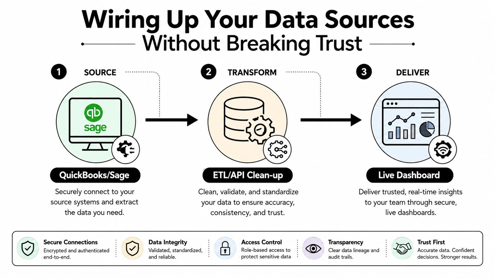
Map every source before building visuals:
- Anchor the ledger: Define which accounts, departments, projects, and periods establish the official financial result.
- Map revenue sources: Connect POS, project-management, billing, CRM, or subscription platforms to the correct revenue categories.
- Map cost sources: Connect payroll, inventory, accounts payable, purchasing cards, and job-cost systems to the right cost centers.
- Connect bank feeds: Use bank activity for cash visibility, then separate cash timing from accrual-basis performance.
- Document transformations: Record how the integration cleans, groups, excludes, and translates source data.
- Reconcile routinely: Compare operational pulls with the ledger and investigate differences before a leadership meeting depends on them.
The common failures are predictable. Billing and the general ledger can both feed the same sales measure, duplicating revenue. Accrual books and cash dashboards can disagree because transactions land in different periods. Chart-of-accounts conversions can assign costs to the wrong category. Stale inventory or job-cost pulls can then diverge from the month-end close.
Set an operational reconciliation tolerance for nightly pulls and perform a full comparison with the general ledger weekly. Follow the controls described in this financial dashboard governance research, and treat the tolerance as an investigation trigger, not permission to accept unexplained differences.
Before a stakeholder meeting relies on a new connector, verify:
- Coverage: Every required account, project, location, and period is included.
- Uniqueness: Revenue and costs are not duplicated across overlapping feeds.
- Timing: Refresh timestamps match the decision cadence.
- Reconciliation: Totals agree with the ledger within the approved tolerance.
- Drill-down: Users can trace dashboard figures back to source transactions.
- Ownership: One person knows what to do when the connector fails.
Cloud architecture creates similar dependencies across systems. Use a practical CTO guide to cloud migration when finance data moves as part of a wider technology change.
The video below provides another visual explanation of data movement and reporting workflows.
For finance-specific implementation considerations, see data analytics for finance. A connector is complete only when the team can explain the number, trace it to a source, and act on it with confidence.
Governance Habits That Keep Your Dashboard Honest
A dashboard can look polished and still fail in the meeting that matters. Governance keeps its numbers accurate, relevant, secure, and assigned to people who will act on them.
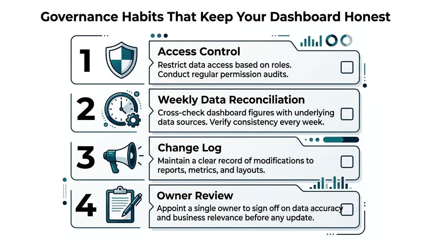
Formalize four routines:
- Name a KPI owner. That person validates the definition, investigates exceptions, and explains movement. Finance may own the calculation, while operations owns the response.
- Set a refresh cadence and tolerance. Record when each source updates, when reconciliation occurs, and what difference requires investigation.
- Review relevance quarterly. Retire metrics that no longer support a decision. Add measures when the business model, strategy, or risk profile changes.
- Control access by role. Protect payroll, margin, customer, and compensation data. Give operating leaders the fields they need without exposing sensitive information unnecessarily.
Put these rules in a one-page governance charter:
| Charter Field | Required Entry |
|---|---|
| Dashboard purpose | The decisions the view supports |
| KPI owner | Named person for every primary metric |
| Data owner | Person responsible for each source system |
| Refresh schedule | Published timing and expected availability |
| Reconciliation rule | Approved tolerance and review method |
| Change control | How definitions and visuals are approved |
| Review rhythm | Monthly standup and quarterly relevance review |
| Access policy | Roles, permissions, and sensitive fields |
| Escalation path | Who resolves a failed refresh or unexplained variance |
Skipping this work produces stale lender reporting, surprise restatements, and disputes between sales and finance. A 30-minute monthly dashboard standup gives owners a regular place to explain exceptions. A 90-minute quarterly review tests whether the dashboard still supports live decisions.
Security belongs in the same routine. Confirm that SSO is available, audit logs capture access and changes, finance administrators are separated from operational users, and departing employees lose access promptly. Earlier governance guidance identifies data interpretation, accounting errors, untimely updates, security, reconciliation, and named ownership as recurring failure points.
With these controls documented, assign the first rollout owners and prepare the dashboard for its 30-day launch.
Your 30-Day Rollout Plan and Next Step
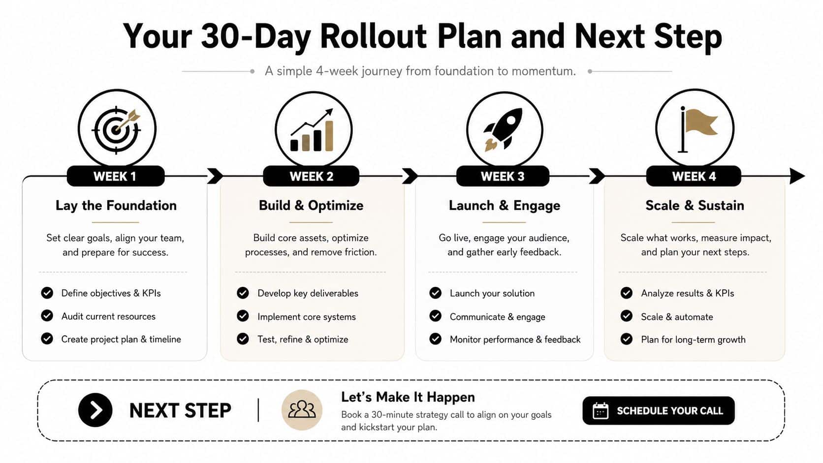
You don't need to wait for a perfect data warehouse. Start with the decisions leadership must make and build a controlled first version around them.
Week 1
Choose the three to five KPIs that connect directly to cash, margin, capacity, or a major operating commitment. Write the metric dictionary before anyone formats a chart. Assign an owner, source system, refresh cadence, decision served, and action threshold for each KPI.
Week 2
Inventory every source feeding the selected measures. Confirm which system owns the official result, identify duplicate feeds, document timing differences, and connect the primary accounting integration. Don't add a new visual until you know where its number comes from.
Week 3
Build the core executive dashboard and one industry-specific view. Keep the main page focused, place exceptions at the top, and put operational drivers before financial outcomes. Reconcile the dashboard to the general ledger within 1%, as the rollout framework requires, then investigate every unexplained difference instead of smoothing it over.
Week 4
Run the governance rhythm with the leadership team. Hold the first dashboard standup, test whether owners understand their thresholds, review access permissions, and identify what information is still missing. Then conduct the relevance review and remove anything that doesn't support a live decision.
The right reporting platform depends on your systems, business model, data quality, and internal capacity. QuickBooks, Sage, NetSuite, Power BI, and specialized reporting tools can all fit different situations. The platform comes after the KPI definitions and reconciliation process, not before. AmbitionCFO offers executive dashboards, KPI dashboards, financial modeling, cash-flow management, margin analysis, budgeting, forecasting, and board-ready reporting for founder-led businesses that need a single decision view.
Book a working session with a fractional CFO to pressure-test your KPI selection, validate your data architecture, and shortlist the right reporting platform for your business. Visit AmbitionCFO to discuss a financial reporting dashboard that connects operational drivers to cash and margin decisions.