

A KPI dashboard is a one-screen view of the few numbers a founder checks every week to make decisions, not a report, a spreadsheet, or a wall of charts. In large organizations, 34% of business users use analytics or BI dashboards at least weekly, while dashboard adoption reached 67% of enterprises by 2023, up from 52% in 2020 (AxioBench dashboard data).
You're probably not asking for another definition. You're asking whether your current numbers can tell you, quickly, which jobs need intervention, whether cash will hold, where margin is leaking, and whether the business is becoming easier or harder to sell. A useful dashboard answers those questions before a month-end package arrives.
For a founder-led company with $10M to $100M in annual revenue, the standard is practical: open one screen, understand what changed, identify the owner of the problem, and decide what happens next. The right question isn't “what is a KPI dashboard?” It's which decisions deserve a dashboard at all?
Table of Contents
- The Monday Morning Moment Every Founder Knows
- The Four Building Blocks of a KPI Dashboard
- Outcome, Diagnostic, and Operational Metrics Explained
- High-Value KPI Sets for Construction, Distribution, and Professional Services
- Design Rules That Make a Dashboard Get Used
- Connecting the Dashboard to Cash Flow and Exit Planning
- Your Four-Week Plan to Launch a Dashboard Owners Actually Open
The Monday Morning Moment Every Founder Knows
At the kitchen counter, coffee beside the laptop, an owner opens a single screen before the 8:30 leadership meeting. The review doesn't begin with a forty-page financial package. It begins with a glance at cash, receivables, margin, active work, and the handful of operating measures that determine whether the week will be calm or expensive.
Within 90 seconds, the owner sees that one project is consuming labor faster than planned, two large invoices are aging, and the sales pipeline won't replace the work scheduled to finish soon. The meeting agenda changes immediately. The project manager gets a margin recovery plan, the controller gets a collection priority list, and the sales leader gets a specific booking target.
That's the working definition of a KPI dashboard. It's a single visual layer, refreshed on a known cadence, that puts decision-relevant numbers in front of the people accountable for acting on them. A dashboard may include charts, cards, comparisons, and drill-downs, but every element earns space by helping someone decide.
A dashboard is not a report. A report explains a completed period and often includes narrative, reconciliations, and supporting detail. It's also not a spreadsheet, even if spreadsheets feed the underlying model. A spreadsheet can calculate anything, but it rarely provides one controlled view with clear ownership and a consistent review routine. And a dashboard isn't a wall of charts exported from a BI tool. More visuals don't create more clarity.
The practical test: if the screen shows what happened but doesn't tell anyone what to do, it's reporting, not management.
The dashboard rests on four building blocks: metrics, targets, visualizations, and refresh cadence. Remove any one of them and the screen loses its operating purpose. The same discipline applies to your broader financial reporting dashboards, where presentation matters only when it supports a decision.
The Four Building Blocks of a KPI Dashboard
A car dashboard works because each display answers a different driving question. Speed tells you how fast you're moving. Fuel tells you how long you can continue. Warning lights tell you where immediate attention is required. A business dashboard needs the same separation between measurement and action.
Metrics show what deserves attention
Start with a small set of numbers tied to the decisions your leadership team makes. Weekly sales booked may tell the owner whether the forward workload is strengthening. Receivables aging may determine who receives a collection call today. Gross margin by job may reveal that revenue growth is masking poor execution.
A metric is only useful when its definition is stable. “Margin” should specify whether it means gross margin, contribution margin, or EBITDA margin, and whether the calculation uses billed revenue, earned revenue, or recognized revenue. Your financial metrics every business owner should track should use the same definitions every week.
Targets create meaning
A number without a target is just a gauge with no red zone. If gross margin is displayed without a target, the owner can't tell whether the result is acceptable, drifting, or urgent. Put the target beside the actual, then add a comparison such as prior period, plan, or forecast.
Targets should also connect to action. If cash falls below the agreed operating floor, the response might be a spending review or a collections sprint. If project margin falls below the approved threshold, the project owner investigates labor, change orders, and unbilled work.
Visualizations reveal the signal
Use the chart that matches the question. A line chart shows movement over time. A bar chart compares jobs, branches, customers, or service lines. A single-number card works for a critical current figure, especially when paired with clear status colors and a target.
A chart can conceal a problem when it uses the wrong visual structure. A crowded pie chart may make customer concentration difficult to compare. A long table may bury the one exception that requires action. Keep the executive view simple and move diagnostic detail into drill-down pages.
Refresh cadence keeps the screen alive
A dashboard that updates after the decision has already been made is decorative. Set the cadence to the rhythm of the business. A Monday morning leadership meeting needs a reliable Monday morning refresh. A cash exception may need more frequent attention, while a strategic ratio can be reviewed less often.
Enterprise software documentation shows that KPI history can be captured automatically on an hourly basis, allowing managers to compare targets and actuals across time (IBM KPI history documentation). The exact cadence matters less than matching the refresh to the decision.
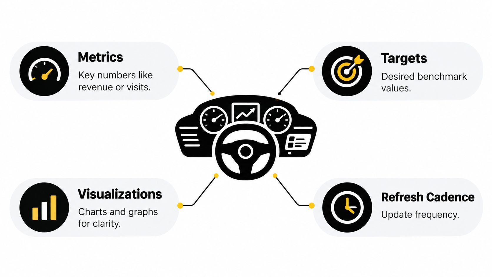
If any building block is missing, the dashboard fails one of its four jobs. It either measures the wrong thing, lacks context, hides the signal, or arrives too late.
Outcome, Diagnostic, and Operational Metrics Explained
Owners often lose trust in dashboards because every metric sits in the same visual row, even though each number answers a different question. Separate outcome, diagnostic, and operational metrics so the review moves from result, to cause, to action.
Outcome metrics tell you where the business ended up. Revenue, EBITDA, and cash belong here. They matter, but they're usually lagging measures. If EBITDA is below plan, the number confirms the problem. It doesn't automatically tell you whether pricing, labor, overhead, or customer mix caused it.
Diagnostic metrics explain why the outcome moved. Gross margin can expose pricing or delivery problems. Utilization can show whether professional services capacity is producing billable work. Win rate can explain why future revenue is weakening before the income statement reflects it.
Operational metrics tell the team what to do this week. Jobs in progress, receivables aging, and pipeline coverage give managers levers they can pull before the next reporting cycle. These measures belong close to the people who own the work.
| Metric Role | Question Answered | When Checked | Example |
|---|---|---|---|
| Outcome | Where did we land? | Weekly or monthly review | EBITDA versus plan |
| Diagnostic | Why did we land there? | Weekly management review | Gross margin by project |
| Operational | What needs action now? | Daily or weekly operating rhythm | Receivables aging by account |
Put the layers in order. Outcome metrics sit at the top, diagnostic metrics in the middle, and operational metrics at the bottom. An owner should be able to scan the result, understand the driver, and assign the next move without opening another file.
Month-end close discipline supports this structure because clean, timely financial data gives the dashboard a reliable foundation. Teams that need a more controlled approach can review close automation for CFOs as they improve the connection between accounting activity and management reporting.
The most common design error is mixing roles in one row. If revenue, project margin, and open purchase orders appear with equal visual weight, the viewer must decide which matters first. That's how dashboards become screens people stop trusting. A sound financial reporting framework keeps the management view concise while preserving detail for review and reconciliation.
High-Value KPI Sets for Construction, Distribution, and Professional Services
Industry context determines which numbers deserve attention. A construction owner shouldn't copy a professional services dashboard, and a distributor shouldn't manage inventory with the same lens used for projects. Start with the closest industry set, then remove anything that doesn't change a decision.
Construction
Construction cash leaks through under-billed work, weak project controls, and slow retainage collection. Start with WIP percentage, backlog in weeks, gross margin per project, days sales outstanding on retainage, and safety TRIR.
The early-warning measures are WIP percentage and gross margin per project. They expose production and profitability problems while the team can still correct them. Backlog, retainage aging, and safety TRIR provide important context, but they often function as report-card measures unless connected to a named response.
The essential construction KPIs for profitability can help refine definitions, especially when project accounting differs across contracts.
Distribution
Distribution leaders need visibility into inventory productivity and service reliability. Use gross margin return on inventory, inventory turns, fill rate, on-time delivery, and customer concentration as a percentage of revenue.
The early-warning signals are inventory turns and fill rate. Falling turns can indicate dead stock or purchasing problems. A deteriorating fill rate can signal stockouts that threaten customer relationships before revenue reports show the effect. On-time delivery and concentration deserve attention, but managers need an action path tied to each exception.
Professional services
For a services firm, capacity and client economics determine whether growth creates cash or merely creates work. Track utilization, realization, average billable rate, project margin, and net revenue retention.
The early warnings are utilization and project margin. Low utilization can expose excess bench capacity. Weak project margin can reveal scope creep, poor estimates, or a delivery team mix that no longer matches pricing. Average billable rate and net revenue retention show whether the commercial model supports sustainable growth.
| Industry | Metric | Why It Matters | Early Warning Threshold |
|---|---|---|---|
| Construction | WIP percentage | Shows whether billed progress matches production | Set a project-specific threshold with the controller |
| Construction | Gross margin per project | Exposes job-level margin erosion | Set a minimum approved margin |
| Distribution | Inventory turns | Identifies slow-moving capital | Set a category-specific floor |
| Distribution | Fill rate | Shows whether inventory supports customer demand | Set a service-level floor |
| Professional services | Utilization | Shows whether capacity produces billable work | Set a role-specific target |
| Professional services | Project margin | Exposes delivery and scope problems | Set a minimum project margin |
Keep the starter set under nine metrics. Don't revise it after the first uncomfortable meeting. Give the team thirty days of real use, then remove, reorder, or redefine metrics based on the decisions people make.
Design Rules That Make a Dashboard Get Used
A dashboard earns attention by making a weekly meeting sharper. Build it in the order the work happens, not in the order the software presents its chart options.
Start with the decision
Write the decision at the top of the design brief. “Which jobs need intervention this week?” is useful. “Show project performance” is vague. The first question identifies the measures, owners, thresholds, and actions. The second invites a report nobody opens.
Limit the first screen to five to nine meaningful KPIs, consistent with dashboard guidance from Domo's KPI dashboard recommendations. If a metric doesn't influence a decision, move it to a drill-down or remove it.
Match the visual to the question
Use line charts for movement over time and bar charts for comparisons across jobs, branches, customers, or teams. Use single-number tiles for critical current values, with clear status against target. Use tables only when the viewer needs to sort or inspect exact records.
Role-specific design matters. A leadership dashboard should not look like a project manager's exception queue. Build one view for each role, group related information, and place the most important metric where the eye lands first, as recommended in Klipfolio's dashboard design guidance.
Set the cadence and owner
Use daily refreshes for cash and operational exceptions, weekly refreshes for pipeline and margin, and monthly refreshes for strategic ratios. Pin the refresh time on the dashboard. A stale number creates arguments about data instead of decisions about the business.
Assign one human owner to every metric. The owner doesn't have to calculate it manually, but they must explain movement and propose a response. If your systems and handoffs are creating broader process friction, a structured approach can help eliminate operational chaos.
Build rule: every KPI needs a definition, target, refresh time, owner, and next action.
Common failures are predictable. Vanity metrics consume attention without changing cash or margin. Missing targets make movement impossible to interpret. Color without meaning turns red and green into decoration. A dashboard nobody can explain in one sentence belongs in the archive. The KPI dashboard design guide provides a useful reference for keeping the screen readable and decision-oriented.
Connecting the Dashboard to Cash Flow and Exit Planning
Build one operating dashboard that serves both cash flow management and exit readiness. The underlying data is the same, and creating a separate dashboard for a future sale forces the owner to pay twice for the same plumbing.
Weekly cash, receivables aging, and gross margin feed a 13-week cash forecast directly. Cash tells you the current position. Receivables aging shapes expected inflows. Gross margin helps you understand whether revenue converts into usable cash or creates more working-capital pressure.
The same screen also prepares the business for buyer and lender scrutiny. Revenue concentration, customer churn, and EBITDA margin influence how outsiders assess the quality and durability of earnings. A business with clean definitions, visible trends, and accountable owners is easier to explain than one dependent on founder memory and spreadsheet reconstruction.
One metric, two meanings
Net revenue retention matters operationally because it shows account health. If existing customer revenue weakens, the service team needs to identify churn, contraction, or expansion problems. It matters financially because a buyer will pay close attention to whether the current revenue base is durable.
Customer concentration affects weekly commercial risk and eventual transaction risk. The sales team may need to diversify the pipeline, while the owner may need to document the relationship, contract terms, and transition plan.
A disciplined revenue reporting approach can help leaders distinguish recurring performance from timing noise and present revenue consistently.
The founder who treats the weekly review as a dress rehearsal for due diligence builds a calmer company and a more credible exit story.
When the dashboard connects operations to cash and exit planning, every weekly review creates evidence. The owner sees what changed, management learns how to respond, and future buyers see a business that can operate without constant founder intervention.
Your Four-Week Plan to Launch a Dashboard Owners Actually Open
A dashboard doesn't need a grand technology project to become useful. It needs a defined decision set, reliable data, and a review habit that starts before the screen looks perfect.
Week 1
Interview the owner and leadership team. Identify the five to seven decisions the dashboard must serve, such as which jobs need intervention, which receivables need escalation, or whether hiring is affordable. Write a plain-language metric dictionary that defines each term, formula, source, owner, target, and refresh time.
The first kickoff agenda item should be:
Which decision will change this week if this number moves?
If nobody can answer, remove the metric from the first version.
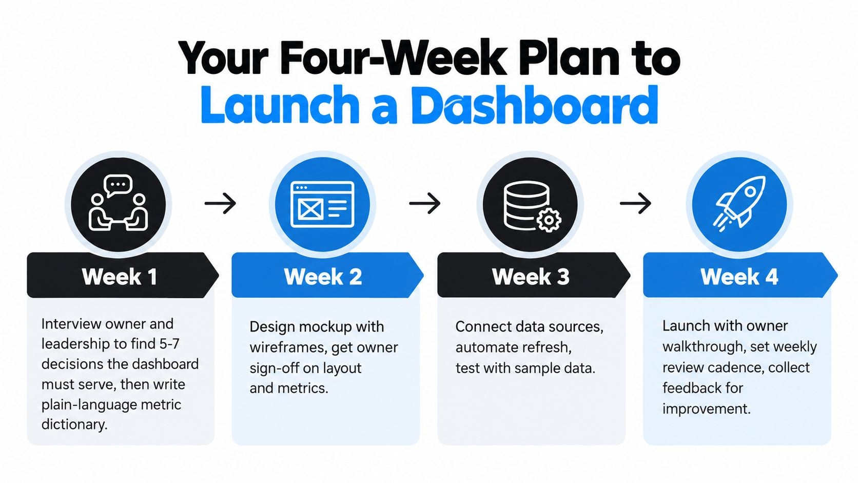
Week 2
Connect the data sources. Define targets with the people accountable for results, then build a first draft in the chosen platform. Give each KPI one primary visualization. Don't add charts because the tool makes them easy to create.
Week 3
Run the dashboard in shadow mode beside the current spreadsheets. Compare definitions, investigate differences, and train the team on the refresh cadence. Ask each user to explain what they would do when a KPI turns off-track. This exposes unclear ownership and weak thresholds before the live review.
Week 4
Hold the first live weekly review. Note what owners and operators clicked, which questions required another file, and which metrics created debate rather than action. Trim the screen, reorder the priorities, and lock the layout for the next review cycle.
For companies that want outside financial leadership during the build, AmbitionCFO can connect KPI dashboards with cash flow modeling, margin analysis, financial reporting, and exit planning for founder-led businesses. Visit AmbitionCFO to discuss a dashboard built around the decisions your leadership team needs to make.