

Monday morning starts with a familiar question: will payroll clear Friday, and what needs to change before then? Yet many founders open a dashboard and find thirty tiles, several date ranges, decorative charts, and no clear answer about cash, collections, margin, or risk.
That isn't a data shortage. It's a kpi dashboard design problem. A useful executive dashboard compresses the business into a decision-ready view, then gives the owner enough context to act without hunting through reports. The strongest design principles favor a single-screen display of the most important information, clear hierarchy, simple interaction, consistency, and the ability to detect abnormal patterns, as summarized in the dashboard usability research.
Table of Contents
- Why Most Founder Dashboards Fail Before the First Decision
- Picking the KPIs That Actually Change an Action
- Balancing Leading and Lagging Indicators
- Building a Layout That Reads in Under Ten Seconds
- How Three Industries Read the Same Dashboard Differently
- Governance, Alerts, and the Weekly Review Rhythm
- Your 30-60-90 Dashboard Rollout Checklist
Why Most Founder Dashboards Fail Before the First Decision
A founder of a growing construction firm once described the Monday cash meeting as “scroll, pause, export, explain.” The dashboard looked complex, but the team still opened spreadsheets to answer basic questions. Revenue was visible. Payroll expense was visible. A sales chart was visible. None of those tiles showed whether recent billings would convert into cash quickly enough.
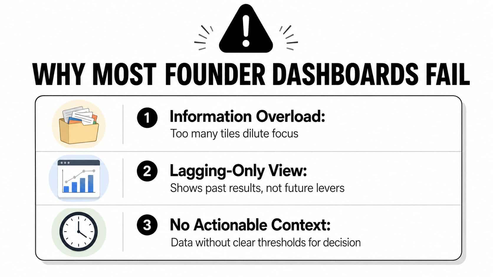
Three design failures create this situation.
First, the dashboard contains too many metrics with no action link. A number can be accurate and still be useless if nobody knows what decision it should influence. Second, the screen favors vanity measures, such as activity or volume, while hiding the measures connected to cash, gross margin, working capital, and forecast variance. Third, the layout forces the eye to hunt. Important numbers sit beside minor diagnostics, every card has equal visual weight, and inconsistent time windows make trends difficult to compare.
The single-screen test
A dashboard should fit on one screen so users can monitor the most important information at a glance. That single-screen principle isn't a demand for minimalism for its own sake. It forces the team to decide what belongs in the executive view and what belongs behind a drill-down.
For a founder-led firm with $10M–$100M in annual revenue, the first screen should answer four questions:
- Can we bill? Are completed work, approved change orders, or delivered goods ready to invoice?
- Can we collect? Which receivables, WIP balances, or customer disputes threaten near-term cash?
- Are we profitable on this work? Is margin holding by job, product line, or client?
- What breaks if nothing changes? Which forecast, backlog, staffing, or liquidity signal requires intervention?
The financial reporting best practices guide can support the reporting foundation, but the dashboard still needs a decision owner. If a tile can't help someone decide what to do this week, remove it or move it to an analytical view.
Picking the KPIs That Actually Change an Action
Start with the decision, not the data source. Founders often begin by asking what their ERP can export. That reverses the sequence and produces a catalog of available metrics rather than a management tool.
Use this five-part filter for every candidate KPI:
- Name the decision. Write the action in plain language, such as “delay equipment purchase,” “escalate an overdue invoice,” or “reprice the next proposal.”
- Link a metric. Choose the measure that gives the decision-maker evidence. A cash balance may not explain the problem, while collections aging might.
- Set a threshold. Define what counts as healthy, watch, or off-track. A number without a target is difficult to interpret.
- Assign an owner. Someone must investigate the variance and recommend the next move.
- Set a review cadence. Cash and WIP may need frequent attention, while strategic measures can support a weekly or monthly conversation.
Keep the executive view to 5–10 KPIs, a ceiling supported by dashboard design guidance focused on single-screen clarity and actionability (Domo's KPI dashboard methodology). Another practical guide recommends 5–7 KPIs, with 3–6 prominent KPIs at the top of an executive view (KPI dashboard selection guidance). Use the range as a control, not a target. If five metrics answer the owner's questions, don't add five more just because the screen has room.
Apply the filter by industry
A $25M construction general contractor might prioritize Days Sales Outstanding on AIA billings, WIP margin variance, and backlog burn rate. Each metric connects to a different action. The billing measure can trigger a review of pay applications, WIP variance can prompt a job-cost forecast update, and backlog burn can influence staffing or bidding decisions.
A $60M industrial distributor may need gross margin by product line, inventory turns by SKU class, and freight cost as a share of revenue. Those measures can guide pricing, purchasing, stocking, and freight policy. A product-line margin tile that never changes a price or vendor decision is only taking up space.
A $15M professional services firm could use utilization, realization, and net retention by client. Together, they expose whether the firm has enough productive work, is converting time into billings, and is retaining economically valuable relationships.
| Industry | Revenue Range | KPI | Decision It Triggers |
|---|---|---|---|
| Construction GC | $25M | Days Sales Outstanding on AIA billings | Escalate collection or billing issues |
| Construction GC | $25M | WIP margin variance | Reforecast job cost and margin |
| Construction GC | $25M | Backlog burn rate | Adjust staffing or bidding pace |
| Industrial distributor | $60M | Gross margin by product line | Review pricing and mix |
| Industrial distributor | $60M | Inventory turns by SKU class | Change purchasing or stocking |
| Industrial distributor | $60M | Freight cost as a share of revenue | Renegotiate freight or delivery terms |
| Professional services | $15M | Utilization | Address capacity or staffing |
| Professional services | $15M | Realization | Investigate write-downs and pricing |
| Professional services | $15M | Net retention by client | Protect or expand valuable accounts |
For teams comparing reporting platforms, Oviond agency reporting solution offers a useful reference for organizing metrics into repeatable reporting views, even when the final executive dashboard is financial rather than marketing-focused. Use the same discipline described in the financial metrics every business owner should track: every KPI must survive the question, “So what would I do differently?”
Balancing Leading and Lagging Indicators
A $40M construction firm can show a healthy prior-month margin while its next cash problem is already visible in under-billed work and delayed approvals. That timing gap explains why founder-led companies need both leading indicators and lagging indicators on the same dashboard.
Lagging indicators show completed results, such as last month's gross margin, prior-quarter revenue, profit, or trailing cash. Leading indicators show conditions that can influence the next result, including qualified pipeline, aged WIP, committed billings, proposal activity, and staffing capacity.
Both matter, but founders often receive a polished historical view because the general ledger is easier to access than operational systems. Finance can close revenue and expenses, publish a margin report, and present a clean record. By then, the decision that created a cash or margin problem may have been made weeks earlier.
Practical rule: Use lagging KPIs to confirm the result. Use leading KPIs to create an opportunity to change it.
Put future levers near the top
A useful starting point is roughly 60% leading indicators and 40% lagging indicators. That balance keeps the executive view focused on intervention while preserving outcome confirmation. It is not a permanent formula. During a liquidity crisis, cash and collections may deserve more space. The purpose is to stop the dashboard becoming a polished history lesson.
Construction firms should place backlog conversion, under-billed WIP, committed billings, and schedule exposure near the top. Completed-job margin confirms what happened. It cannot recover a billing opportunity that the team has not identified.
Distributors should emphasize inventory aging, vendor fill rates, open purchase orders, and freight pressure. Inventory turns confirm the result, while aging and supplier reliability give the operator more time to adjust purchasing, stocking, or delivery terms.
Professional services firms should put proposal win rate, bench utilization, staffing coverage, and pipeline quality ahead of historical realization. Realization shows what the firm captured from completed work. Pipeline and capacity show whether next quarter's revenue has operational support.
The visualization may include illustrative values, but the design principle is broader: outcomes belong beside the drivers that can still influence them. A founder should not have to interpret a falling margin without seeing the jobs, clients, products, or operating conditions behind the movement.
Build a trustworthy source map
Trust starts before the visualization layer. Assign every KPI to a source system and document its definition.
- GL or ERP: Revenue, expenses, cash, accounts receivable, accounts payable, and balance-sheet measures.
- Job-costing system: Contract value, cost-to-complete, WIP, committed cost, billings, and job margin.
- CRM: Pipeline stage, proposal status, win probability, and expected close timing.
- Payroll or timekeeping: Utilization, billable hours, staffing cost, and capacity.
- Spreadsheets: Manual assumptions, customer-specific schedules, or temporary feeds that need a named owner and retirement plan.
Power BI, Looker, Sigma, or another reporting layer can sit above these systems. Visualization will not resolve conflicting definitions. A data contract should state the KPI name, formula, source fields, inclusion rules, period convention, owner, refresh expectation, and approved use. Without it, operations may define backlog as signed work while finance defines it as work expected to bill. Both teams can believe their number is correct.
Set refresh expectations according to decision speed. Cash and WIP may need daily updates, while pipeline commonly supports a weekly cadence. Display the last refresh time and flag late feeds instead of presenting stale numbers.
Run three owner-level sanity checks
Founders do not need an analyst for every validation step. Before a Monday review, run these checks:
- Prior-period variance: Confirm the dashboard's prior-period variance is under 2% when reconciled to the approved source, as specified in the operating control.
- Row-count reconciliation: Check that dashboard rows match the relevant subledger totals.
- Manual spot-tie: Select one metric, trace it from the dashboard to the source transaction or report, and confirm the calculation.
Forward-looking measures also require clear language. Keep the distinction between a target scenario and management's current expectation consistent with projection versus forecast, so a founder does not treat a projection as the operating forecast.
Building a Layout That Reads in Under Ten Seconds
A founder reviewing a $10M–$100M construction, distribution, or professional services firm should see the business condition without scrolling, switching tabs, or decoding equal-sized cards. Use a hierarchy that supports fast monitoring through simple structure, consistent interaction, and visible exceptions, as outlined in this dashboard usability framework.
The top row states the condition
Place cash, runway, and one revenue measure in the top row. Show each measure with a directional delta against a named comparison period and a clear status signal. Put the decision-driving KPI at the top-left, consistent with KPI dashboard layout guidance.
Avoid decorative gauges. Use a large, left-aligned number, a short label, the comparison, and a small sparkline or arrow. Keep the period visible. A month-to-date result beside a quarter-to-date trend can produce a false conclusion unless the labels make the difference obvious.
The middle explains movement
Use the middle band for three to five trend lines covering the drivers behind the top row. A construction firm may need bookings, billings, gross margin, collections, and backlog. A distributor may prioritize inventory turns and product-line margin, while a services firm may need billable hours, utilization, and pipeline coverage.
Show trends before diagnostics. The owner first needs to know whether the condition is improving or deteriorating. Put segment detail behind a click or drill-down. Lower density reduces cognitive burden but demands more interaction, while excessive density can impair usability and performance, a trade-off examined in dashboard cognitive-load research.
The bottom supports investigation
Reserve the bottom strip for aged AR, WIP exposure, utilization, job detail, product-line margin, or client-level exceptions. Tables often work better than charts here because the owner needs names, amounts, dates, and accountable people.
Use one accent color for thresholds and exceptions. Green, amber, and red can work when paired with text or directional symbols, but do not turn every tile into a traffic light. Color should direct attention toward an action.
Responsive hierarchy examples, including dark mode SaaS dashboards, reinforce the finance application: typography and spacing should clarify priority. Remove any tile that fails the ten-second test. If the founder cannot state what changed and what needs attention, the tile has not earned its place.
How Three Industries Read the Same Dashboard Differently
The dashboard's structure can stay constant while the interpretation changes sharply. A construction general contractor, an industrial distributor, and a professional services firm may all use revenue, gross margin, cash, and forecast variance. They won't assign those numbers the same urgency.
A construction GC scans over or under-billing first, then WIP at risk, before reviewing the project schedule. An over-billed position may affect future billing capacity, while under-billed WIP can signal cash exposure or a job-costing issue. The top-right corner may belong to a project exception count rather than a revenue trend because the owner needs to know which jobs require a conversation this week.
A distributor fixates on inventory turns, stock-out risk, product-line gross margin, and freight pressure. The same cash metric that signals stability to a services firm may hide inventory trapped in slow-moving SKU classes. The visual emphasis shifts toward category tables and supplier exceptions.
A professional services firm studies utilization, realization, and next-quarter pipeline coverage. Revenue can look healthy while bench capacity rises or write-down exposure grows. Here, the most valuable drill-down may be by client, partner, service line, or employee group.
The healthcare clinic shown in the visual adds a useful contrast, linking patient wait time to satisfaction rather than treating the time measure as an isolated operational statistic. That same interpretation discipline applies to the financial dashboard. A metric gains meaning from the decision and business model around it.
Owners building a specialized view can also use law firm KPI dashboard guidance to see how client economics, realization, staffing, and collections can be organized around professional-services decisions.
A tile earns its place only when it answers a yes-or-no question the owner can act on this week.
Governance, Alerts, and the Weekly Review Rhythm
A dashboard becomes a management system only when people use it on a fixed rhythm. Without ownership and escalation, an alert becomes another unread notification and an exception becomes a recurring discussion with no resolution.
Assign a named owner to every KPI. The owner doesn't have to calculate the number, but they must know why it moved, confirm the source, and propose the next action. Finance may own cash conversion, operations may own WIP aging, sales may own pipeline quality, and service leadership may own utilization.
Fix the Monday meeting
Run a recurring 30-minute Monday review with a fixed agenda:
- Scorecard: Review the top-row state and changes from the prior review.
- Alerts: Discuss only threshold breaches and material exceptions.
- Actions: Assign one owner, one next step, and a due date for each issue.
Refresh rules should specify source timing, tolerance thresholds, and fallback procedures when data arrives late. A late WIP feed should show “pending refresh,” not a stale green status. A missing pipeline update should have a named person responsible for correcting it before the review.
Design alerts around business risk
Construction GCs can trigger alerts for underbilling, change-order aging, and job-costing corrections. Distributors can watch Days Inventory Outstanding, inventory aging, vendor fill rates, and gross-margin drift. Professional services firms can track utilization slippage, realization pressure, and write-down exposure.
Use three alert tiers:
- Weekly variance breaches: A KPI moves outside its approved comparison range.
- Threshold exceptions: A condition crosses a defined limit, such as backlog coverage dropping below three months.
- One-time events: A job-costing correction, contract change, major customer dispute, or other event requires immediate review.
The escalation path should be explicit. The KPI owner handles the first diagnosis. The leadership team gets involved when the issue crosses functions, threatens cash or margin, or requires a capital or staffing decision. A fractional CFO can diagnose the issue when the source data is technically available but the business still can't connect the variance to a reliable action. For owners separating controllership from strategic planning, FP&A versus accounting provides useful context.
Your 30-60-90 Dashboard Rollout Checklist
A useful rollout starts with the owner's decisions and builds outward. Don't begin by asking a software vendor to reproduce every existing report. Begin with the questions that must be answered in the Monday meeting.
Days 1–30 establish the foundation
- Confirm the 5–10 executive KPIs and write the decision linked to each one.
- Validate the GL, ERP, job-costing, CRM, payroll, and spreadsheet sources.
- Assign a named owner and definition to every KPI.
- Build the executive single-screen layout with clear targets, comparisons, and refresh labels.
- Test the draft with the founder and one operating leader.
Days 31–60 add the operating layer
- Finalize threshold and exception alerts.
- Run two full Monday review cycles using the dashboard instead of a spreadsheet.
- Document the refresh process, late-data fallback, reconciliation checks, and escalation path.
- Gather viewer feedback and remove redundant tiles.
- Add drill-downs only where a top-row exception requires diagnosis.
Days 61–90 lock in adoption
- Integrate leading indicators into the executive view.
- Schedule a monthly deep-dive review for drivers, definitions, and source quality.
- Brief the leadership team on date ranges, targets, color conventions, and ownership.
- Retire any chart that hasn't driven a decision.
- Review whether the dashboard still reflects the company's current model, customers, jobs, and capital priorities.
Use this checklist as an owner-led audit, then ask a fractional CFO to diagnose the gaps you can't resolve internally. The right review should identify which definitions are unreliable, which metrics are decorative, and which missing leading indicators are delaying cash or margin decisions.
AmbitionCFO helps founder-led businesses build decision-ready KPI dashboards, connect them to cash flow and profitability analysis, and establish the review rhythm that keeps the numbers useful. Visit AmbitionCFO to discuss a dashboard diagnostic and prioritize the fixes that will improve your next leadership review.