

A lot of law firms start with the wrong question. They ask which metrics belong on a dashboard before they ask whether the dashboard can explain why cash feels tight even when the firm looks busy. A law firm KPI dashboard only becomes useful when it shows how attorney time turns into billed work, how billed work turns into collected cash, and where that conversion stalls.
That's why the flashy version usually fails. Partners do not need another screen full of activity metrics that look good in a meeting and disappear the moment someone asks about payroll, receivables, or lockup. A cash-first scorecard gives leadership a clearer answer to the essential question, which is whether the firm is converting effort into money fast enough to fund the business.
Table of Contents
- Why Most Law Firm Dashboards Fail Leadership
- The Core Math Behind Law Firm Performance Metrics
- Choosing the Right Metrics for Your Dashboard
- Designing a One-Page Scorecard Layout
- Connecting Data Sources and Setting Refresh Cadences
- Your 30-Day Dashboard Implementation Plan
Why Most Law Firm Dashboards Fail Leadership
Busy calendars do not mean a healthy firm. Clio's benchmark data projects average attorney utilization at 38%, which works out to about 3.0 billable hours in a standard eight-hour day, while the same benchmark set projects an 88% realization rate and 93% collection rate. In cash terms, that leaves roughly 2.4 hours' worth of work ultimately collected per eight-hour day, which is why a dashboard can flatter leadership if it highlights activity without showing conversion (Clio benchmarks).
Partners often see full dockets, strong time entry habits, and steady work in progress, then miss how much value is trapped before it reaches the bank account. The screen looks productive because the pipeline is full. Cash flow tells the harder truth. Clio's median lockup figures of 43 days for realization lockup, 32 days for collection lockup, and 93 days total lockup show how a firm can look busy and still feel short on cash (Clio benchmarks).
The wrong hierarchy
Most dashboards start with activity because activity is easy to count. That order makes the firm look active, but it does not help a managing partner decide whether to hire, slow spending, or press collections. A better hierarchy starts with cash conversion, then production, then marketing.
Practical rule: if the dashboard cannot show where value leaks between hours worked and cash collected, it is a report, not a management tool.
Working-capital metrics belong near the top of the page because they reveal how much unrecovered value the firm is carrying, even when realization and utilization look acceptable. WIP days, AR aging, and total lockup are the numbers that show whether billing discipline is turning effort into cash. If you want a cleaner reporting discipline behind the scorecard, the framework in financial reporting best practices is a useful companion.
The best dashboards are direct. They show when the firm is busy but under-cashing, and they force the conversation away from vanity metrics and toward liquidity. For a useful reference on the key law firm profitability KPIs to track, start there, then organize those KPIs around cash first.
The Core Math Behind Law Firm Performance Metrics
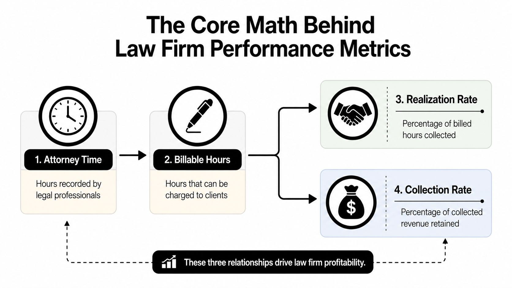
A law firm KPI dashboard only works when the numbers connect. Too many leadership teams look at utilization, realization, and collection as separate scorecards, then wonder why the firm still feels tight on cash. The better view is a single chain from capacity to billing to collections.
Utilization, realization, and collection
The first layer is utilization = billable hours ÷ available hours × 100. It shows how much attorney capacity becomes billable work. If utilization is weak, the firm is usually dealing with either not enough work or too much non-billable drag, and the dashboard should help partners separate those two problems.
The next layer is realization = billed ÷ (hours × standard rate) × 100. Write-downs show up here. Every write-down reduces realization before anyone even looks at collections, so a firm can post decent utilization and still leave revenue on the table at the billing stage.
Then there is collection = collected ÷ billed × 100. That is the clearest test of whether billed work turns into cash. Partners tend to care about this number because it is the closest signal of whether the firm can pay people, cover overhead, and keep operating without strain.
Lockup is the cash gap
Lockup is where workflow delay becomes working-capital pressure. As noted earlier, Clio's benchmark data points to a long delay between work performed and cash collected, which is why managing partners should care more about lockup than about a polished year-end report. Those lagging days show how long the firm waits to convert time into money.
A dashboard should answer one question fast, where is the value sitting today, in time entry, billed work, or receivables?
The same logic applies at the matter and client level. A close look at customer profitability analysis helps explain why some clients look busy on paper but consume more time, write-downs, and collection effort than they return. That matters because a firm can have strong gross revenue and still create weak cash if the wrong work gets too much attention.
For teams that want a clean definition set for KPI language, the AI enablement KPI resource is a useful reference point. Law firms do not need jargon. They need a small set of measures that make the conversion path visible.
The point of the formula layer is visibility, not sophistication. Once a firm knows which stage is breaking down, it can stop arguing about raw activity and focus on the conversion problem that is draining cash.
Choosing the Right Metrics for Your Dashboard
A good dashboard is selective. A great one is almost stubborn about what it refuses to show. Law firms work best with a small set of metrics grouped into financials, productivity, billing, and clients, because those four buckets cover the questions partners ask in meetings.
Start with the leadership question
Metrics should follow the decision, not the other way around. That principle shows up clearly in legal-operations guidance from Wolters Kluwer, which ties metrics to a specific business goal and recommends starting with the why before defining the KPI set (Wolters Kluwer legal operations metrics). If the question is about cash, the dashboard should prioritize realization, collection, WIP, and AR aging before it worries about softer activity measures.
Here's a practical way to think about the four categories:
- Financials: revenue per lawyer, profit margin, average matter value.
- Productivity: billable hours, timekeeper utilization rate.
- Billing: realization rate, collection rate.
- Clients: client retention, client acquisition cost.
For firms that want a parallel example outside legal, the structure in Voicedial.ai sales KPI examples is useful because it shows the same discipline, metrics should map to a business decision, not just a dashboard space.
The first five metrics to trust
One practitioner framework recommends starting with just five metrics, intake response time, lead-to-consult conversion, consult-to-matter conversion, WIP days outstanding, and AR over 60 days (Buildrhub dashboard framework). That sequence forces maturity. It keeps the dashboard from becoming a junk drawer and makes sure the numbers are trusted before the firm adds more detail.
| Category | KPI | Formula | Leadership Question |
|---|---|---|---|
| Financials | Revenue per lawyer | Total collected revenue ÷ number of lawyers | Are we generating enough value per attorney? |
| Financials | Profit margin | Profit ÷ revenue | Are we converting revenue into profit? |
| Productivity | Billable hours | Hours billed to clients | Are attorneys creating enough chargeable work? |
| Productivity | Timekeeper utilization rate | Billable hours ÷ available hours × 100 | Is capacity being used well? |
| Billing | Realization rate | Billed ÷ (hours × standard rate) × 100 | Are we discounting too much? |
| Billing | Collection rate | Collected ÷ billed × 100 | Are billed fees turning into cash? |
| Clients | Client retention rate | Retained clients ÷ prior-period clients × 100 | Are relationships durable enough to support growth? |
| Clients | Client acquisition cost | Marketing spend ÷ new clients | Is growth efficient? |
If you need a broader KPI taxonomy for professional services, the internal guide on professional services KPIs fits well with this structure. It helps separate what belongs in leadership reporting from what belongs in operational review.
The skip list matters too. Early-stage dashboards should avoid trying to track dozens of items at once. If the team can't explain why a metric changes, or what action follows it, it probably doesn't deserve a row yet.
Designing a One-Page Scorecard Layout
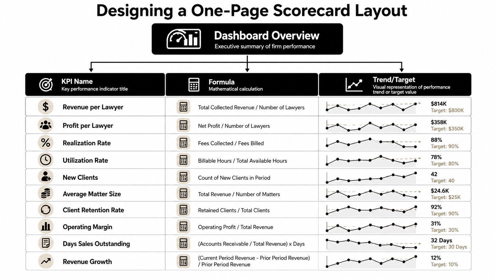
A law firm KPI dashboard belongs on one page, and it still needs to feel complete. In partner meetings, the format that holds up is usually 8 to 12 rows, reviewed monthly, with each row answering the same questions, what it is, what the target is, what happened this month, what happened last month, and whether it is on track. Without a target, a dashboard becomes a number dump.
Build the rows around decisions
A scorecard works better when it is organized around how the firm makes decisions. I usually split it into three operational layers: intake and marketing, production, and finance. That layout shows whether the issue starts at the front door, in the work itself, or in cash conversion, which is the part partners care about once the month closes.
A clean row structure looks like this:
- KPI name
- Formula
- Target
- This month
- Last month
- On-track flag
That format forces trend comparison. It also keeps the meeting from drifting into stories about one-off numbers with no context.
Set targets with discipline
Targets should come from benchmarks, historical performance, or both. As mentioned earlier, market reference points for utilization, realization, collection, and lockup help leadership see where the firm stands. Use those benchmarks as a starting point for discussion, not as a rigid rule.
The visual design should let partners spot exceptions fast. Use red, amber, and green sparingly. Keep formulas visible. Do not bury the current month in the far-right corner of a cluttered spreadsheet export. A dashboard should work in the first minute of the meeting, not after ten minutes of explanation.
For firms building around cash flow discipline, a fractional finance lead can shape the presentation so it ties back to forecasting and owner decisions. AmbitionCFO, for example, works with firms on KPI dashboards, cash flow management, and forecasting, which makes the scorecard more useful when it has to support planning instead of just reporting.
Connecting Data Sources and Setting Refresh Cadences
A dashboard dies when the data is stale or inconsistent. Timekeeping, billing, practice management, and accounting need to feed the same definitions, or partners will spend the meeting arguing about which number is right instead of what to do next. The best-looking dashboard in the world is useless if the source systems disagree.
Match the refresh to the metric
The cleanest approach is to refresh each layer on its natural schedule. Time entry should be checked daily, because that's where the raw capacity signal lives. Billing and financial figures can refresh monthly or through API connections, but only if the underlying coding is consistent and the rate changes are handled correctly.
Practical rule: if two partners can point to two different versions of the same metric, the issue isn't reporting, it's governance.
A reliable build usually follows a simple ownership model. Someone owns timekeeping compliance, someone owns billing definitions, and someone owns finance logic. That reduces the chance of a partner meeting turning into a data dispute that no one can resolve on the spot.
Common traps to avoid
Stale WIP figures are a classic problem, especially when matters move quickly and time entry lags behind the work. Inconsistent matter coding creates another layer of noise because the same kind of work gets grouped differently from month to month. Realization calculations also break when rates change mid-year and the dashboard doesn't preserve the original math.
For firms deciding whether to pull this into the finance stack or keep it inside the accounting workflow, the comparison in FP&A vs accounting is a useful frame. It clarifies which layer should own forecasting, analysis, and reporting logic.
The implementation checklist should be simple:
- Identify core systems: timekeeping, billing, accounting, and practice management.
- Define the exact data points: hours, billed value, collected value, WIP, AR.
- Choose the integration method: API, direct export, or controlled manual entry.
- Set refresh frequency: daily for time, monthly for financial review.
- Validate accuracy: compare source totals before the dashboard goes live.
Many firms overbuild. They want perfect automation before they've agreed on definitions, and that delays the whole project. A better approach is to get one reliable version of the truth first, then automate the parts that move the meeting forward.
Your 30-Day Dashboard Implementation Plan
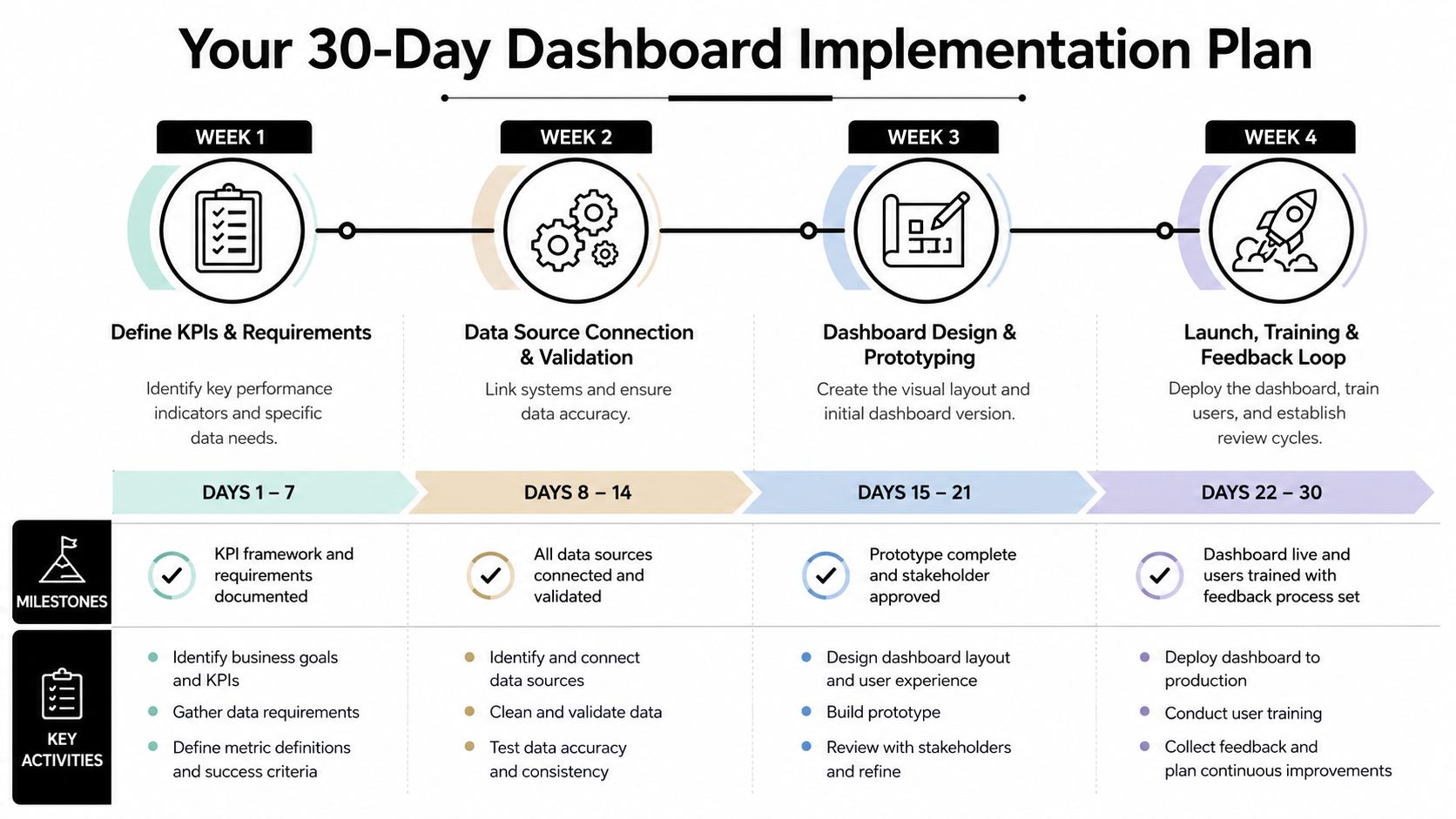
A usable dashboard can go live in 30 days if the firm keeps the scope tight. Week one should define the leadership questions, not the software. If the partners' main question is associate productivity, the dashboard should prioritize utilization and realization rates over client acquisition metrics. If a concern is cash timing, the build needs to center on WIP, AR, and collections pace.
Week by week execution
In week one, write down the decisions partners want the dashboard to support. In week two, choose the metrics that answer those decisions and validate the definitions against source systems. In week three, build the one-page scorecard and test the layout with a small leadership group. In week four, run the first monthly review and note which metrics triggered action versus which ones got ignored.
For firms that need to connect reporting to liquidity planning, the internal guide on how to create a cash flow forecast belongs in the same planning conversation. A dashboard without a forecast can show the current problem, but it cannot show how long the firm can carry it.
What to do next
The first version does not need to be perfect. It needs to be trusted, reviewed, and tied to an action. If a metric does not change a decision, remove it. If a number cannot be explained in one minute, the definition probably is not ready.
A fractional CFO can help validate the design, connect the dashboard to cash flow management, and make sure it supports planning for future ownership or exit decisions. That matters when the dashboard has to answer more than one audience, such as managing partners, department heads, and owners thinking about succession.